Lots of bluster about coming storms but what does the data we have tell us?
What jumps right out is that the hot whopping 1997 El Nino shows remarkable agreement in phase and strength between all the indices. We really don’t know what causes El Ninos so it is possible the 1997 alignment of indices was the cause of the powerful Nino. It is also possible some unknown force pushed the data into alignment.
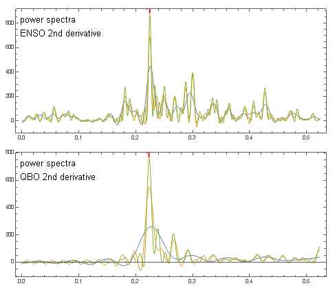
Paul Pukite has done some interesting work with QBO. The Quasi Biennial Oscillation (what a mouth-full of hay) is a stratospheric wind that switches direction about every half a year. Paul has shown that the second derivative of QBO correlates well with ENSO. His power spectra are shown below.
Still struggling with whether second derivatives are meaningful. In the first graphic is is clear that the first derivative correlation of QBO with the other indices is not impressive at all. Nevertheless, QBO was “all in” for 1997.
QBO appears to be “all out” this year. It must be noted that the 2015 data goes only through August and has four months to continue growing. QBO might even reverse field, but it will not be phase matched as it was in 1997.
If QBO really is a predictor, the weight of evidence points to a normal baby boy, and not a Super Nino like 1997.


Pingback: Sea Level and ENSO | geosciencebigpicture