
You don’t radiatively warm the third rock from the sun without reducing long wave radiation from the top of the atmosphere to space. Period. [Unless shortwave absorption increases]
For far too long, we have ignored CERES data here at the Trunkmonkey Research Institute. Partly, this is because the data is only available in netCDF format developed by the “University Corporation for Atmospheric Research”. This format is good for painting raster images with color shaded values on 1×1 degree grid cell maps, but it is difficult to extract numeric values for use in other sorts of analysis.
At https://www.unidata.ucar.edu/software/netcdf/software.html, UCAR has published a long list of free and proprietary software for reading netCDF. We tried netCDF4Excel as there was some internet chatter that it worked well and we wanted the data in EXCEL anyway. We downloaded the latest version, only to be greeted with a popup that “this app cannot be used on this computer”. We also tried a cloud based app perporting to read netCDF to EXCEL, but EXCEL refused t open the output, claiming it was corrupt.
We use ARCMAP all the time and it is straightforward to paint color shaded rasters, but the ESRI toolbox utility supposed to create a table from netCDF does not work with CERES data.

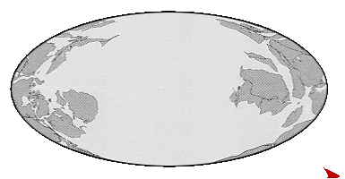
You can go to the CERES data and look at visualizations, and when you click on them this apparently very helpful screen pops up as above. Unfortunately, the “Save as ASCII” and “Save as PNG” buttons do not work. What you see is a screenshot.
Normally we would just digitize this, but the one thing that does work is when you mouse over the above screens, the data pops up. This particular graphic is so important that we deemed it worth the trouble, and while entertaining vile thoughts about the NASA nerds, duly recorded all the monthly values in a notebook.
The CERES data above comes from the TERRA (before 2002) and then the AQUA Moderate Resolution Imaging Spectroradiometers (MODIS) instruments. The satellites are just above 70 Km altitude in sun synchronous polar orbits that cross the equator at the same time every day. The TOA is considered to be 20 Km altitude.
The first striking feature of the above data is the large swings in TOA longwave radiation to space between the northern and southern hemisphere summers. As the min/max values in the screenshot show, the range is some 12.5 W/M2, with the northern hemisphere always radiating more to space than the southern hemisphere in their respective summers. Land must radiate to space more effectively than ocean.
The second striking feature of the above data is that it does not seem to be decreasing as MODTRAN predicts from the some 2 W/M2 additional absorption from human CO2.

It is actually increasing. Above is the raw data, but this overstates the case a bit because the data ends in September, 2017. We wish the data continued to finish 2017, and as we approach the end of the first quarter 2018, it does not seem unduly burdensome for NASA to provide the data. Anyway, there are various mathematical tricks one might use to correct this, all with drawbacks. What we have done below is arbitrarily complete 2017 with 2016 monthly data.

The result looks like this. There has been a substantial increase in the long wave radiation to space in the CERES data. This is how you cool the planet, not warm it. This data glaringly contradicts MODTRAN to the extent that one or the other is wrong. Exploring this discrepancy will be difficult because the formats are different, but it is very important. The discrepancy between CERES and MODTRAN will be the subject of this series.


Pingback: CERES and MODTRAN II | geosciencebigpicture
Pingback: CERES and MODTRAN III | geosciencebigpicture
Pingback: CERES and MODTRAN IV | geosciencebigpicture