What is Waiting in the Wings?

We recently finished a series of posts on the 2 good greenhouse gas in which we established that all the “earthlight”, the long wave spectra emitted at the temperature of the planet surface is extinguished within about 100 meters of the surface in the bands comprising the fundamental bending strike zone of CO2.

This past series established what CO2 cannot do to warm the planet. We are told that the “wings”, bands outside the fundamental bending zero transmission zone will pick up the slack and warm the planet. This series will explore what CO2 can do to warm the planet.

Modtran Transmission v Fundamental bend

The argument is very simple. The earth emits a finite amount of light. When that light is extinguished by complete absorption and zero transmission, it’s gone! It can’t just sneak around somewhere. The atmosphere completely blankets the earth.

In the graphic above transmission to the tropopause at 280 ppm CO2 is shown. There is a large flat spot of zero transmission. This flat spot is defined by the fundamental bending mode of CO2 shown here at 400 ppm. The zero transmission zone grows accordingly when 400 ppm transmission is plotted, but the point here is that zero at 280 ppm and zero now equals zero difference.

The red plots are the significant excitation bands for CO2. The fundamental 667.4 band represents nearly 90% of the total energy, and the other bands had to be exaggerated orders of magnitude to even get them to show up in the graphic. Four of these bands fall outside the primary zero transmission flat spot, but two of these, 647.1 and 720.8 form their own zero transmission troughs even at 280 ppm. This leaves only 544.3 and 597.3, shown with dotted lines to their corresponding troughs as candidates for warming in the wings.

What of these wings? Below are MODTRAN CO2 only 280 ppm vs 400 ppm comparisons for a few altitudes:

Modtran 5km 280v400ppm CO2

Modtran 10km 280v400ppm CO2

Modtran 15km 280v400ppm CO2 Modtran 20 km 280v400ppm CO2 Modtran 70 km 280v400ppm CO2

If your eyes are anything like mine, you will see that there is very little difference between the 280 and 400 ppm plots for CO2 alone and that no large lateral “wings” of radiance emerge. Ain’t much chicken on them wings.

In the next post we will explore what makes the “wings” take flight. Water.

Posted in Climate, Greenhouse Spectra, Radiance | Tagged | 10 Comments

The 2 Good Greenhouse Gas III (Looking Up)

We have been looking down so far. What happens when you stand on the ground and point a spectrometer up? Interesting things.

downwelling ground up


In the CO2 bands around wave number 667 a spectrometer pointed up from the ground sees radiation at very near surface temperature. In the cases above that near surface temperature was about 245  K in Barrow and 300 K at Nauru. The spectra are very different in form as a result of different humidities in the atmospheric window and ozone bands to the right. In the cold, dry air at Barrow the instrument reads near zero except for the ozone bands. Those photons are running away straight to space and there is nothing to see. In the warm, moist air of Nauru the window is very “dirty” and noisy due to scatter and radiation by water.

Looking Up Barrow and Nauru vs Looking down Sahara

We can add our trusty Sahara looking down for comparison. The hot dry air is a good inverse for Barrow.

All Up

Finally we add an interesting spectrum looking up from Cerro Toco at 5 km altitude (but still on the ground) in the Atacama Desert in Chile. Notice how in the dry desert air the atmospheric window very closely matches Barrow with the photons fleeing at the speed of light and the instrument seeing next to nothing, while the higher near surface temperature shows clearly in the CO2 bands.

Note the difference between Barrow and Cerro Toco. The dip in the Barrow (Grey) CO2 bands results from a strong surface inversion. Close to the instrument, the radiance reads at a lower temperature. You essentially get an inverted altitude profile of CO2  absorption. Below is the 1 meter path at 400 ppm.

PQR2

infrared_spectrum surface looking up and down Arctic Ice

In an amazing experiment shown above, the same instrument, one pointed up from the surface of Arctic ice, and another looking down from some sort of platform at 20km took measurements of the same place at essentially the same time. In the atmospheric window the U-2 looking down sees a very chilly near surface at~267 K. The one on the ice looking up sees a much chillier 160 K. The 20 km looking down sees a very clean signal of high intensity, the ice looking up sees a noisier signal of very low intensity.

They both see a clean blackbody signal in the CO2 bands with the 15 micron/667.4 wave number “spike” pointed up towards higher intensity and temperature. No surface inversion here.

In this series we first explored the lack of correlation between temperature and CO2 at long time scales, the dependence of CO2 on temperature at Neogene scale, and the dependence of CO2 variation around the trend on temperature, but not the trend itself as the trend becomes distorted by human emission in the satellite era.

We followed up with a look at radiance on the IR earth bands and found that satellites are seeing CO2 radiance taking place between ten and twenty kilometers in the upper troposphere and lower stratosphere. We then found that the same instruments pointed up from the surface see CO2 radiating very near the surface.

The problem is that the 2 good greenhouse gas  gobbles up all the surface IR within a hundred meters of the surface. This is clear from transmission.

Gap

Even at 280 ppm preindustrial levels of CO2 there is ZERO transmission of  surface IR to the tropopause in the fundamental bending bending bands. Furthermore, the 667.4 band and its homologous rotational bands DEFINE the zero transmission gap.

The fundamental bend commands 89% of the Boltzmann absorptive and radiative potential of CO2. This is why it gobbles up the surface IR so fast. This is why CO2 does not drive temperature at any time scale. It has already eaten all the earth photons in its strike zone at preindustrial levels. Adding more CO2 has no effect in these bands.

It is just too good.

Posted in Climate, climate sensitivity, Greenhouse Spectra, Optical Material Properties, Spectra | Tagged | 11 Comments

CO2

CO2

This is just a bit of fun attempting to graphically represent the concentration of CO2 in the atmosphere at 400 ppmv. The area of the square is set to 1. The problem becomes how to show an invisible molecule with a length of about 3 Angstroms. The choices range from putting a single dot with an area of .0004 to a hundred dots at .000004. The latter option results in dots that are barely visible.

A case can be made for the single dot. You could actually render a single realistic CO2 at this scale. Maybe another day.

Anyway, this exercise represents three dimensions in only two and having more dots seems more satisfying today. It calculated as 11.11 dots at this size. I put in 12.

What a generous guy, no?

Changed my mind and did it today.

CO2 2

Posted in Climate | Leave a comment

The 2 Good Greenhouse Gas II

When show a Carbonist that there is no evidence of CO2 causing significant “global” warming at any scale from deep time to the last 35 years as we did in the last post, they usually look at you funny and say, “Hey man, it’s a greenhouse gas, how can it possibly not cause warming?”

It is a very reasonable question. The answer can be found in the text speak of the title, and will be developed below.

Thanks to the cold war and the clear need to understand the spectral properties of the atmosphere for targeting and guidance systems, we have extensive laboratory work and computer code on atmospheric spectra and three levels of computer models meticulously calibrated by aircraft, balloon, and satellite to ground measurements. Much of this work was done at the Air Force Cambridge Research Laboratory at Hanscom Air Force Base.

Unlike the climate models currently undergoing first order calibration, the HITRAN, MODTRAN, and LOWTRAN models are mature and have undergone four decades of ever more accurate development. The following is from chapter 18 (Fenn et al, 1985) in  the Handbook of Geophysics.

Fenn et al 1985

It shows what the IRIS spectrometer on Nimbus 3 at 1100 km saw looking down. It also shows their calibration process. Below is a radiance spectrum by the same instrument class from Nimbus 4 at a similar altitude over the Sahara. This cartoon also shows the Planck temperatures that match the spectrum and the lapse rate of the atmosphere with possible altitudes that match the Planck temperatures. It also shows the “atmospheric window” where only the ragged and weak water bands and the shark bite of ozone mar a perfect Planck curve.

Nimbus 4_Planck Bounding_Lapse Rate annotated

We need some lower altitude readings to limit the possibilities. The information is unavailable to the common man, or at least the exact aircraft and instruments used are hard to find. The Air Force had a number of planes that routinely flew at 20 km. There is a widely available spectrum looking down from 20 km meters and simultaneously up from the Arctic. We will explore that later, but it is hardly the place to go for a typical spectrum. Fortunately, the information is embedded in their code, and we have the MODTRAN spectrum at 600 ppm CO2 from 20 km altitude below.

Nimbus 4 vs Modtran 20km


From 20 km it is crystal clear from the intercepts that all the signal is coming from the tropopause or lower stratosphere. The irradiance units in the MODTRAN output were transposed to radiance by this method. What is most interesting is what has changed and what has not. The MODTRAN is for a U.S. standard atmosphere and the Nimbus is over the Sahara. The ~35K difference may be a bit much for average temperature difference, or not, depending on time of day and season. A bit of lapse at 280K cannot be ruled out from the intercepts. The weak water bands in the atmospheric window show a lot less amplitude as well as cooling a lot from 1100 km over the Sahara to 20km over the U.S. This seems to an an interesting general difference between arid and more humid regions as we will see.

By far, the most important result of this exercise is that while all the  water and ozone bands (and the CO2 “wings” at 600 ppm) shift to a lower temperature, the bottom of the CO2 bands does not within the accuracy of this cartoon, and may even increase a bit.

All Down Looking, Planck Bounding


Here we jump back up to Nimbus and add two spectra from the tropical West Pacific. (Real time science need not follow a straight path.) You see how this works. In the atmospheric window outside the ozone “bite” in clear skies the spectrometer sees pretty much surface temperature and that temperature changes from place to place. Even the ozone bite changes temperature which is very interesting because it suggests the absorption is taking place nearer the surface than the stratosphere. What never changes is the “flat” bottom temperature in the CO2 bands.

The spectrum from the top of a thundercloud anvil is also very interesting. What makes it so cool is we know exactly where that is. The reason thunderclouds form a flat “anvil” top is because they hit the inversion where warmer temperatures above prevent further rise. Didn’t want to clutter the graphic, but trust me, through the atmospheric window (now shut) except for the bumps in the CO2 and ozone bands, the temperature tracks the 215K Planck curve like it was on rails. That was the temperature of the cloud top that day and the CO2 and ozone bands were radiating at a higher temperature. This strange behavior foreshadows Antarctica as we will see.

We have been trying to follow a consistent line of reasoning. The problem with all prior analyses has been inconsistency. They switch units in mid stream, making real understanding very difficult. We have followed earth spectrum radiance from Nimbus level 1100 km to MODTRAN 20 km altitude with the same units. Below this level the data vanishes. Maybe it is classified? Maybe the troposphere is too noisy for the old instruments?

Anyway, there seems no choice but to switch units. The information for the troposphere is available in model form as “transmittance” and “absorption.” These are inverse (one minus the other) and expressed on a scale from zero to one. Before switching to a troposphere scale format transmittance at 280 ppm or pre industrial CO2 is added to the current platform below along with the ozone profile.

280 ppm transmitance and ozone added

What is interesting is that the zero transmittance flatspot at pre industrial CO2 is broader than the “flat” bottoms all the satellite and MODTRAN radiance spectra show at 217 K, and the “arms” of 280 ppm transmittance are broader than even the 600 ppm MODTRAN radiance.

We have shown that all the measurements and model looking down from above the tropopause see photons in the CO2 bands radiating at the temperature of the lower stratosphere. We have established that a virtual spectrometer flying just below the tropopause and looking down (as represented by model transmission) sees nothing in a somewhat broadened “flat spot” in the same bands. Zero transmission.

Somewhere between the surface and the tropopause the 2 good greenhouse gas has gobbled up all those photons. We will explore this and start “looking up” at troposphere scale in the next post.


Posted in Climate, Optical Material Properties, Photon, Physics, Radiance, Spectra | Tagged , | 1 Comment

Quick and Dirty Irradiance to Radiance

Couldn’t believe it when it turned into a huge mathematical cluster to convert units of irradiance or spectral irradiance as used in models to radiance as used in measurements. Rather than get into the intricacies of spherical harmonics, figuring steradians, and guessing the aperture sizes of the instruments, we offer here a quick and dirty conversion based on rubber sheeting images to match the Planck Constants.

Quick and Dirty Irradiance to Radiance

Gordon’s law: 120 mW/m2 sr cm-1=.38 W/m2 cm

Posted in Climate, Radiance | Tagged | 1 Comment

Quantum Dot

Twinkle, twinkle quantum dot,

What is true and what is not?

Is all Isaac, Albert, and Niels sought,

Summarized inside you, dot?

Should I believe, or should I not,

A computer from your wiles be wrought?

Should you shed more light than heat,

Wouldn’t that be quite a feat,

For such a nano tiny teat.


Posted in What's going on here? | Tagged | Leave a comment

The 2 Good Greenhouse Gas

Anyone with a big picture perspective can see that there is no correlation between CO2 and temperature at any scale except the clear dependence of CO2 on temperature in the ice cores; and temperature control of the variation of CO2 but not the trend at human scale.

Phanerozoic Temperature and CO2

You don’t need any statistics to see there isn’t much correlation at Phanerozoic scale.

Temperature and CO2 Half Phanerozoic

Things get a lot more certain when we zoom in to half of the Phanerozoic scale or 300 million years. If there is any relationship here it is CO2 lagging temperature by about 30 million years. That is way too long for any known process except weathering and even that is a stretch. Calling this zero correlation as well.

18O Benthic vs Vostok CO2

Things change when we zoom in to the scale of 5 million years as the planet descended into current ice age, the Pleistocene. It is well known that temperature drives CO2 in the ice core data. There is also temperature data from 18 Oxygen from the Ocean Drilling Project that goes back much further. In the graphic above the 400 thousand years of Vostok CO2 is plotted against the 18O series and the agreement is very good! There is good reason to suspect that the same relationship goes back 5 million years.

Vostok CO2 vs D18O

Here we zoom in to a half million years to see some detail. The well known relationship of temperature driving CO2 in the ice core temperature data holds for the seafloor drilling temperature data as well.

RSS Anomaly vs Time Derivative CO2

In the graphic above after Ferdinand Englebeen we zoom into the human scale of 35 years. Although the trends are different, temperature captures most of the variation in CO2. We can say that at human scale temperature drives the variation but not the trend.

We have zoomed wildly from 500 million year scale, to 250 million year scale, to 5 million year scale, to 50,000 year scale, to 50 year scale. We find no rational correlation at Phanerozoic scale, CO2 dependence on temperature at Neogene scale, and temperature control of CO2 variation but not the trend at human scale.

What does this mean?

I don’t know and I doubt you do either. The separation of variation from trend at micro human scale is interesting. Obviously they are both important. The separation cannot continue indefinitely or it would negate the well established temperature dependence of CO2 at the higher Neogene scale.

We need to find the inflection points where temperature control of only the variance transitions to control of both the variance and the trend, and in much deeper time the transition from temperature control to zero correlation. Much can be learned from this exercise and it will be the subject of a future post.

For now we have established that CO2 does not significantly control temperature. Why not?

We will answer this in a future post.


Posted in Climate | Tagged | 3 Comments

Much Ado About Noses II

We left off the nose theme with the quandary that the surface temperatures as measured about the height of the human nose in places humans frequent on the planet differs significantly in trend from measurements by satellite of various levels of the lower atmosphere and of the lower atmosphere (troposphere) as a whole.

GISS anomalies no smoothe

Clearly the altitude of our noses is warming faster than the other altitudes in the troposphere recorded by the  satellites, and the lower stratosphere seems very flat since the two big volcanoes.

GISS Ananomalies vs Lapse Rate


In the Graphic above the various altitude temperature series are scaled with the middle of the range at their appropriate altitudes to allow a rough comparison with the lapse rate of the atmosphere. The lapse rate was scaled to fall amongst the profiles. A shorter series from the middle stratosphere is added and it seems to be cooling sharply.

Everybody knows it gets colder when you go up in altitude. The reason for this is that the surface is the primary heat source for the atmosphere. In the regions where the atmosphere cools quickly with altitude (the troposphere) the temperature series’ trended higher quickly from the beginning of the record in 1979 to about the millennium, and thereafter slowed way down or stopped increasing. In the lower stratosphere where the lapse rate goes to zero and begins warming again due to ozone the series does the opposite, declining during the period before the millennium and then flattening out.

What about our noses? There are sooo many reasons to discount the surface temperature record.

Weather station distribution

To begin with, the distribution of surface stations follows the human nose to wherever humans frequent. Antarctica has seven stations, making that one station for each 1% of the planet that continent covers, and they are all on the coast or on the anomalous Antarctic Peninsula. To get a less than laughable coverage of the planet statistically minded folks infill the unsampled area using the sparse existing data.

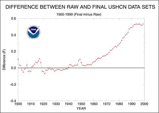
Secondly, there is a striking bias in the results from recent “adjustments” to the data. This is what NOAA acknowledges.

Noaa Adjustments

The vertical axis on this graphic is the difference between the raw data recorded and the adjustments. The trend is significant. This is just to 1999. Since then exponential further adjustments have been made.screenhunter_2410-aug-30-20-28

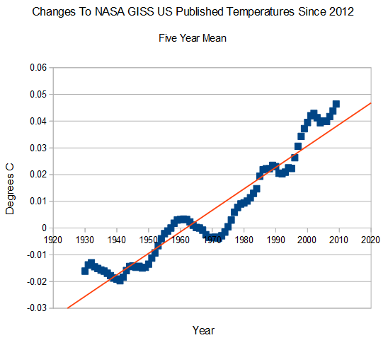
Steve Goddard shows the adjustments the US data since 2012. It is worth noting that the US is by far the best sampled real estate on the planet according to the station distribution two graphics back.

Thirdly, surface thermometers re planted conveniently in front of human noses at airports and cities where all manner of activities converge to distort the temperature upwards.

However, arguments can be made that the adjustments are legitimate. Rather than get into a rhetorical exercise, we take the much adjusted surface data at face value here. Accepting for the sake of argument that the temperature at the elevation of our noses is increasing faster than the rest of the atmosphere, what does that mean?

Some would have it be our rude flatulence of gases. The primary excrescences of combustion are water and Carbon dioxide in a ratio of 2:1. By curious fate these happen to be the two most important “greenhouse” gases that slow the escape of surface energy to space.

Of the two water is by far the most important. It has over 3700 excitation states compared to CO2’s 13, and its absorption bands span the entire spectrum. It not only slows surface energy’s escape to space, it captures and thermalizes incoming solar radiation as well.

Another important difference between the properties of these gasses is the tendency to disperse. CO2 mixes so well that monitors in Antarctica, Hawaii, and Alaska show the same concentration. Water is very strongly concentrated in the surface layer of the atmosphere and its uneven horizontal distribution basically describes the vegetation zones on earth.

All that water coming out our “pipes” right next to the surface thermometers must surely be part of the reason they read higher, but this effect could still be a problem as it is a greenhouse effect warming the “planet”.

Another reason the surface thermometers read higher that is not warming the “planet” follows from a surprising property of CO2. It is “too good” a greenhouse gas. Its primary excitation states are so efficient at gobbling up surface energy that none of it currently survives the first 100 meters of the atmosphere.

CO2 Electron Population vs Transmission to Troposphere

In the graphic above CO2 excitation wavelengths and their Boltzman densities are plotted against  a cartoon of transmission. You can see that 8 of the 13 CO2 excitation wavelengths have zero transmission at 280 ppm, the pre industrial or “natural” level.

What this means is that even before significant human excrescence no energy was escaping to space in these wavelengths. A good round number would be that half of the excitation potential of CO2 is nullified at pre industrial levels because it is so bloody good at gobbling those photons.

Adding more CO2 is just beating a dead horse in these bands. No additional greenhouse effect can be created. What CO2 additions do in these bands is lower the altitude of energy exhaustion and move the thermalization closer to the surface thermometers. They read warmer, not because the planet is warming, but because the same amount of energy is brought closer to them.

About half of the CO2 we put in the air does nothing more than warm our noses.

Posted in Climate, Energy of Photons, Photon, Spectra | Tagged | Leave a comment

The Earth is Falling! – Land Subsidence and Water Management in California

Still a good amount of sanity in academia if you know where to look. A link referenced in the post ( Land Subsidence from Groundwater Use in California )is well worth the read if you live in California.

Source: The Earth is Falling! – Land Subsidence and Water Management in California

Posted in Climate | Leave a comment

Much Ado About our Noses

You get the idea that nobody thinks about weather stations. Budofcourssse, with futbol and all the other distractions this should really not be surprising.

The fact remains that weather stations are ergonomically designed louvered boxes designed to be opened and the instruments read at about the height of the human nose.

Nothing wrong with that. Just that we have a surface temperature record before satellites (and after) on land that registers at the height of the human nose.

At sea it is different. Originally the thermometers were probably at human nose height on the decks of ships which were more than five feet above the ocean surface. Corrections have been attempted for this. Then there were buoys, which may or not have been five feet off the surface.

In neither case is the distribution of measurements even or representative of the planet surface. Once again the measurements are tailored to human specifications of where we prefer to live or travel.

TLS TTS TTT TLT

Satellites are different. They have their limitations, but they measure everything. Not where we live. Not where we travel or do business. Not just temperature at the height of our noses. Everything.

In the graphic above the top curve is the much adjusted and interpolated latest version of the Land and ocean surface data (our noses).

Moving down the two and four kilometer tropospheric data (TLT and TTT respectively) are barely distinguishable.

Moving yet further down in red is the top of troposphere (TTS) at about 10 kilometers.

The bottom curve is the lower stratosphere (TLS) at 17 kilometers.

The trend lines are second order polynomials and it is interesting that the human nose (surface) temperature trend is linear even as polynomial. The TTT “total” troposphere at 4km is linear as well. The “lower” troposphere at 2km is slightly declining as polynomial, but the two are indistinguishable as linear trends.

When we get to the upper troposphere and lower stratosphere we see a very different story. Near the tropopause, a shorter time series, shows a slight polynomial increase not significantly different from a zero linear trend. The lower stratosphere shows a stabilized decline.

The two big stratospheric spikes are the volcanoes El Chichon and Pinatubo. These register at the tropopause as well but not in the lower levels.

GISS anomalies no smoothe

Conversely, the strong el nino of 97/98 registers strongly from the tropopause to the surface, but only manages a half hearted spike in the lower stratosphere.

It should be evident that the only metric that shows a significant trend since the turn of the millennium is the one at our noses. We will explore the reasons for this in the next post.

Posted in Climate | Leave a comment