
The lower troposphere is a big place and it is difficult to understand what a published temperature really means when viewing NASA GISS or UAH data. This difficulty becomes important as thermometer surface temperature data seemingly diverges from satellite derived TLT.
A burning question is, “what is the implied surface temperature of a given TLT value?”
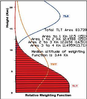
Here we pursue a graphical approach to derive the median altitude of the TLT weighting function. From this median the average lapse rate can be used to derive an implied surface temperature.
In a previous post we explored the relationship between ocean surface temperature and TLT in absolute (not anomaly) terms. The ocean is substantially warmer in all cases, but to determine whether or not the atmosphere can ever warm the ocean an implied surface temperature would be very useful.
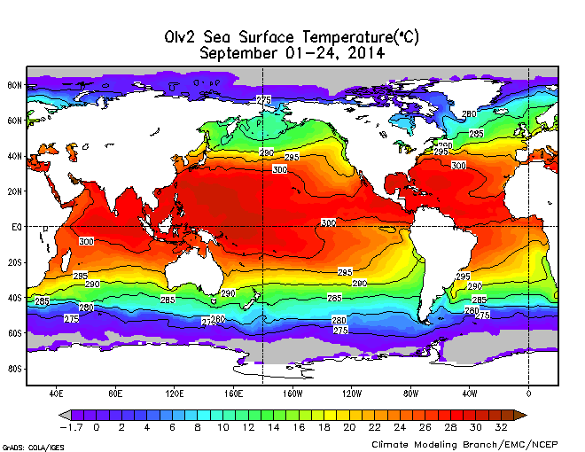
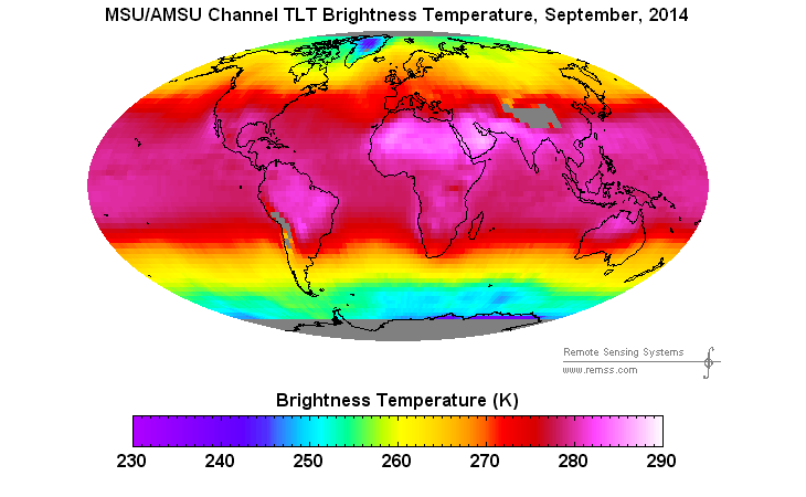
From this you can see that a typical temperature for the tropical ocean would be 300 K and for the tropical atmosphere 280 K. The average lapse rate is 10 K per kilometer. The implied surface temperature of 280 K TLT is 280+34.4=314 K. The 34.4 is derived by projecting the lapse rate at 10 K per kilometer down from the median (seemingly also mean) weighting function at 3.44 Km of altitude.
Unfortunately, it is not even close.
The same applies if we try moving 45 degrees north or south to average ocean temperatures of 285 K and TLT of 260 where the implied surface temperature would be 294.4.
Ain’t science a bitch? Maybe there is a mathematical aspect of the weighting function that defies an area under the curve approach. Maybe the graphic is distorted.
The reason we know the implied temperature is wrong is that NOAA has these cooperating ships reporting SST and air temperature in near real time. You can go to the National Data Buoy Center Ship Observations Report and see all the ship data between the most recent 0400 and 0440 hours.

One can treat any given day as a random sample, kind of like a telephone survey. This was 8-20-2015. The data was parsed to lat long, air temp and water temp. All ships with missing data were culled. The data was sorted by latitude.
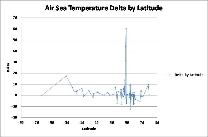
Negative delta values indicate air warmer than ocean. There are definitely places where the air is warmer than the ocean. They appear concentrated in the northern hemisphere mid latitudes, but then again, everything is. That is the bias in ship routes.
The average temperature delta reported on this day was +1.98. This is how we know the -14 for the tropics and the -9 for the mid latitudes implied from TLT is wrong.


