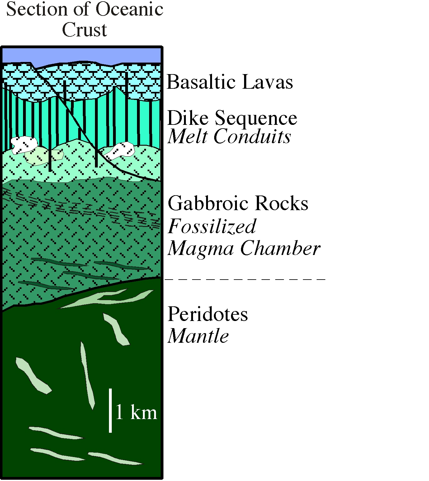
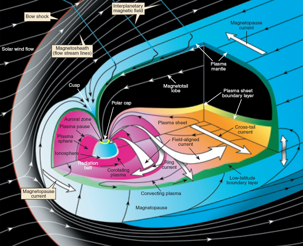
History on Ice

,

maybe this works

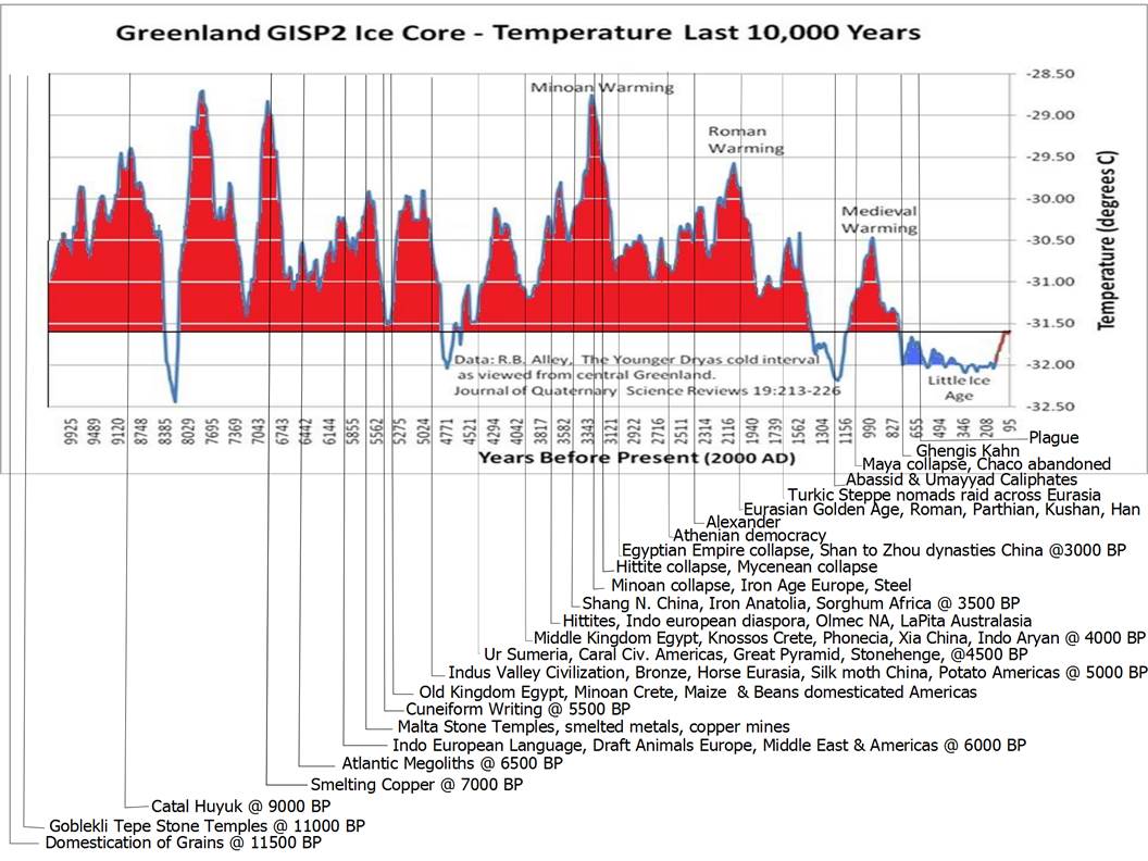
This graphic of Greenland ice core temperature based on data by Alley has been making the rounds. I took a notion to plot human history against it and don’t know who to credit for the base graphic, but grateful acknowledge it as not my own work. Unfortunately the WordPress picture lice chewed mercilessly on the image.

One can interpret it many ways. There does seem to be some correlation between warmer periods and cultural flourishing, but nothing very convincing. What does stick out is the large number of cultural collapses around the “Minoan” spike. Minoan civilization collapsed on the upswing, and the Hittite, Mycenaean, Egyptian, and Shan empires on the down swing of this spike.

The following graphic by Robert Rhode has been around a while, but it is a great piece of work.

Holocene digitized

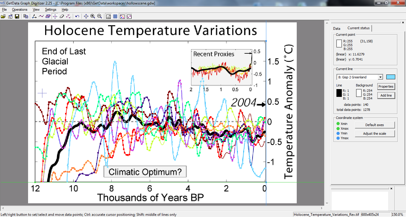
A typical response is to throw up one’s hands as OMG, look at the spread in these unreliable proxies, how can we know anything from these? I will argue that the proxies are perfectly good and the variation is regional. The proxies hark from regions as varied as the tropical western Pacific, Antarctica, and Greenland. An interesting aspect is the seeming convergence of all these disparate proxies to something approaching consensus about 6000 BP.

I digitized them per the screenshot in order to deconstruct the regional variation and see what else may have been going on during the Minoan spike.

Collapse, Golden Age


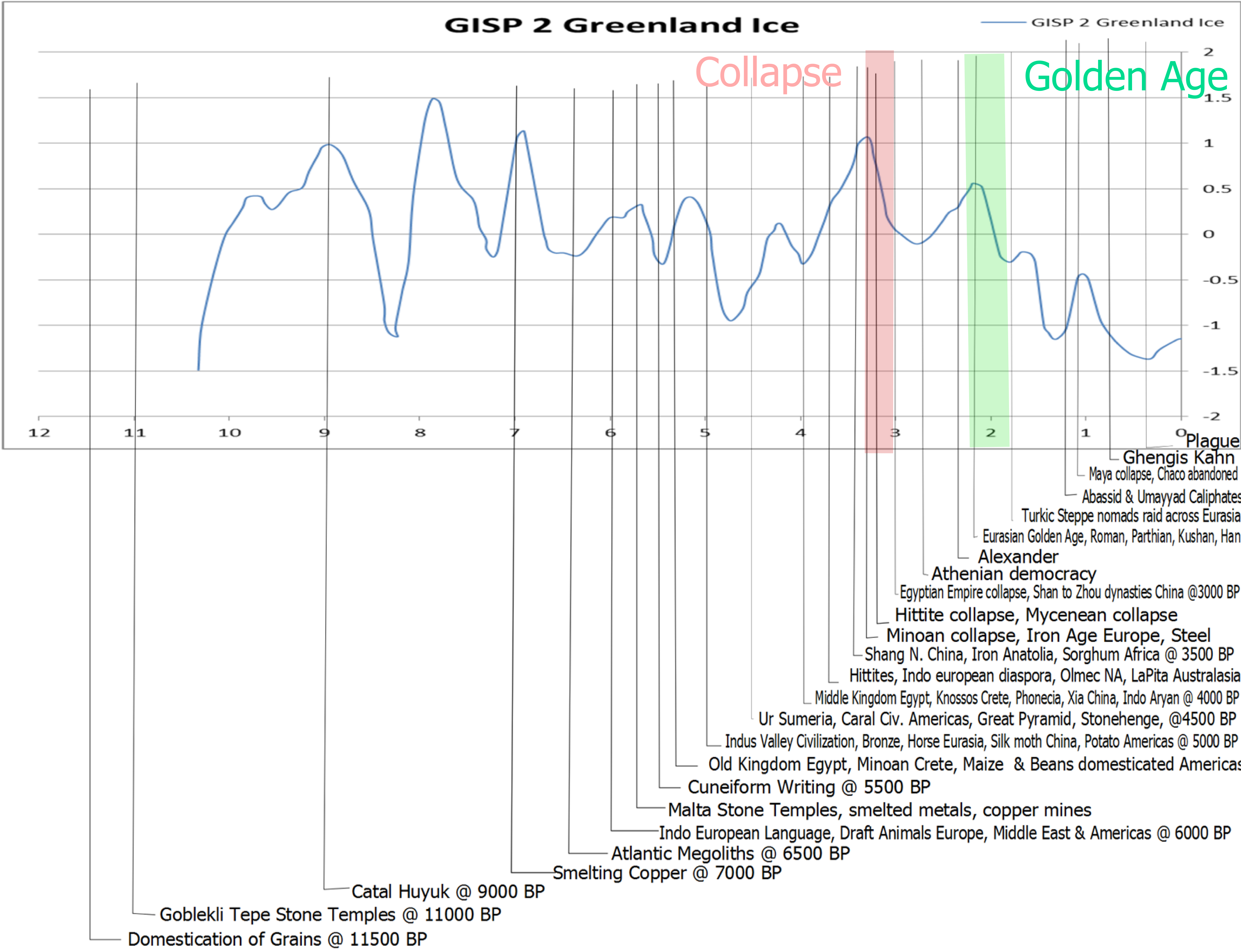
Here is a less dramatic smoothed version of Alley’s GISP 2 smoothed as digitized from the graphic above. It is substantially similar, but now we can compare all the proxies with history. The only interesting features I see are the multiple civilization collapses around the “Minoan” spike and the “golden age” of Eurasian civilizations; Roman, Parthian, Kushan and Han around the more broad shouldered and half a degree lower “Roman” warm period.

You must realize that the Greenland ice cores are by far the most flamboyant proxy.  The other proxies show far subtler response to the Minoan spike.

Gisp vs N. Atlantic Annotated


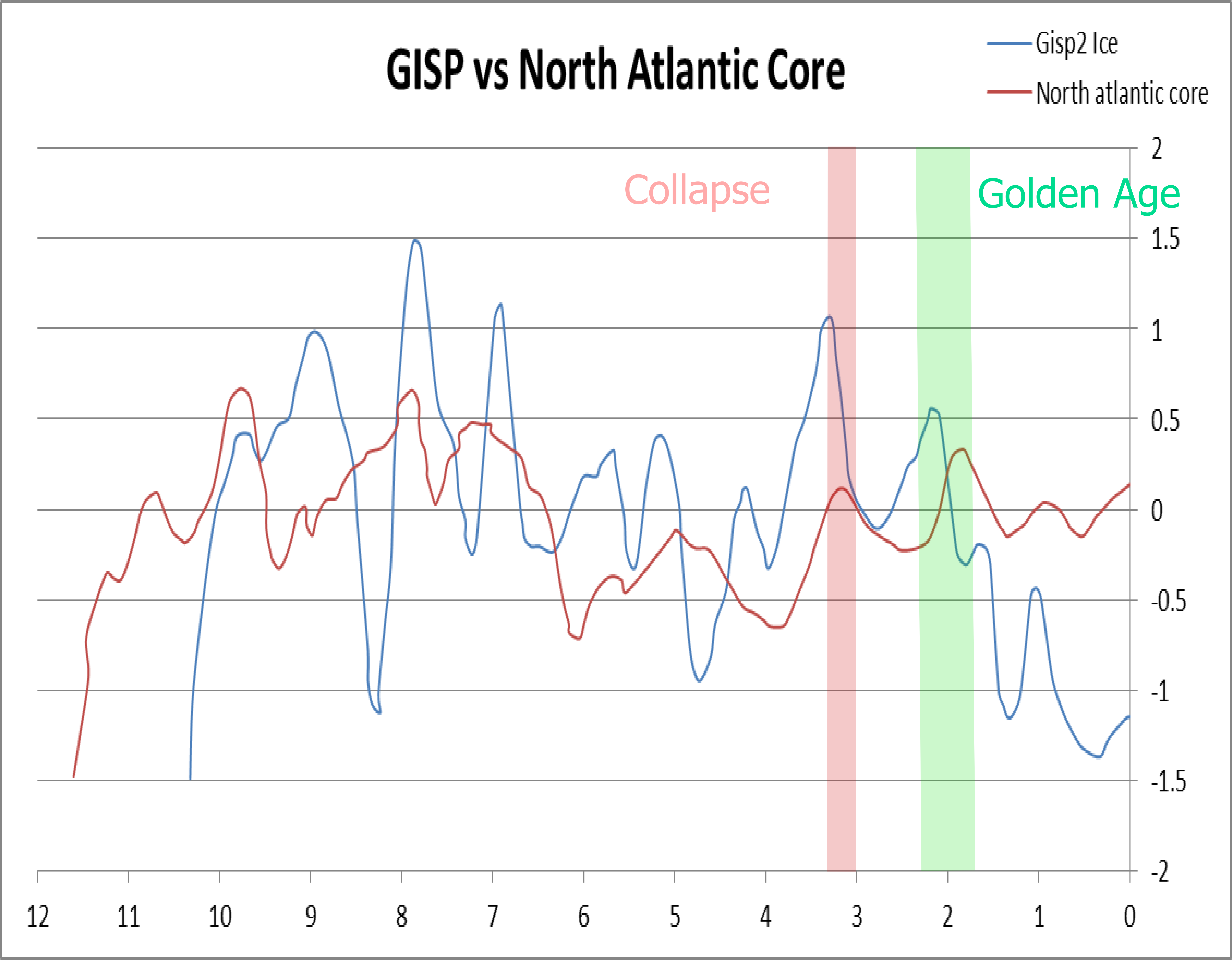
The comparison to the North Atlantic sediment core is very interesting because the ocean warming clearly led the continental ice warming. This lead progressively diminished before going anti phase with the ice during the “6kya convergence”, and then lagging the ice through a much subtler response to the Minoan and Roman warm periods.

This will not be an argument that climate determines history,  seemingly nothing is ever that simple. Many historians have cited Iron weapons as a cause for the multiple collapses beginning about 3300 kya, but the Hittites, who many would equate to Indo-Europeans bearing Iron and the hegemons of this trend, also collapsed during this period.

When several proxies show significant spikes and multiple civilizations collapse, it is at least worth exploring.

Tropical Pacific vs Tropical Atlantic Annotated


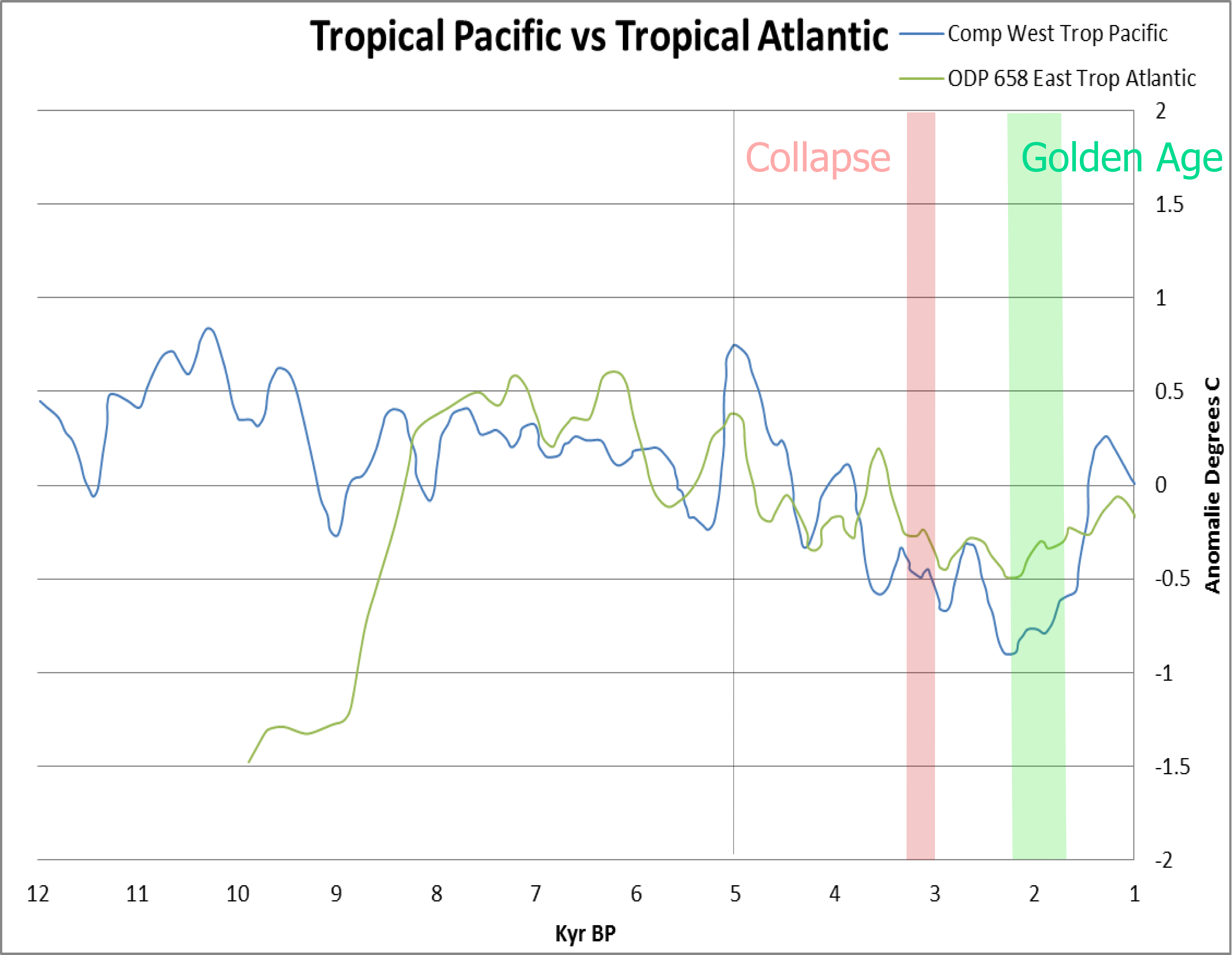
One of the more amazing results of this exercise is this which shows the western tropical Pacific was cruising along well above normal and was actually cooling as the tropical Atlantic was beginning a sharp rise out of the last glaciation.

We tend to think of the oceans as vast stabilizing heat sinks, but this data belies the notion. The north Atlantic warmed like a rocket for 500 years and both tropical oceans show surprising spikey behavior. Note the one degree 5 kya spike in the Pacific.

GISP vs Vostok Annotated


This comparison of Greenland and Antarctica is telling as the rocket ship rise out of the last glaciation began 1200 years earlier in Antarctica. Vostok is generally less animated than Greenland but there is a prominent 1.5 degree spike 4.5 kya.

Central Antarctic Cores Annotated

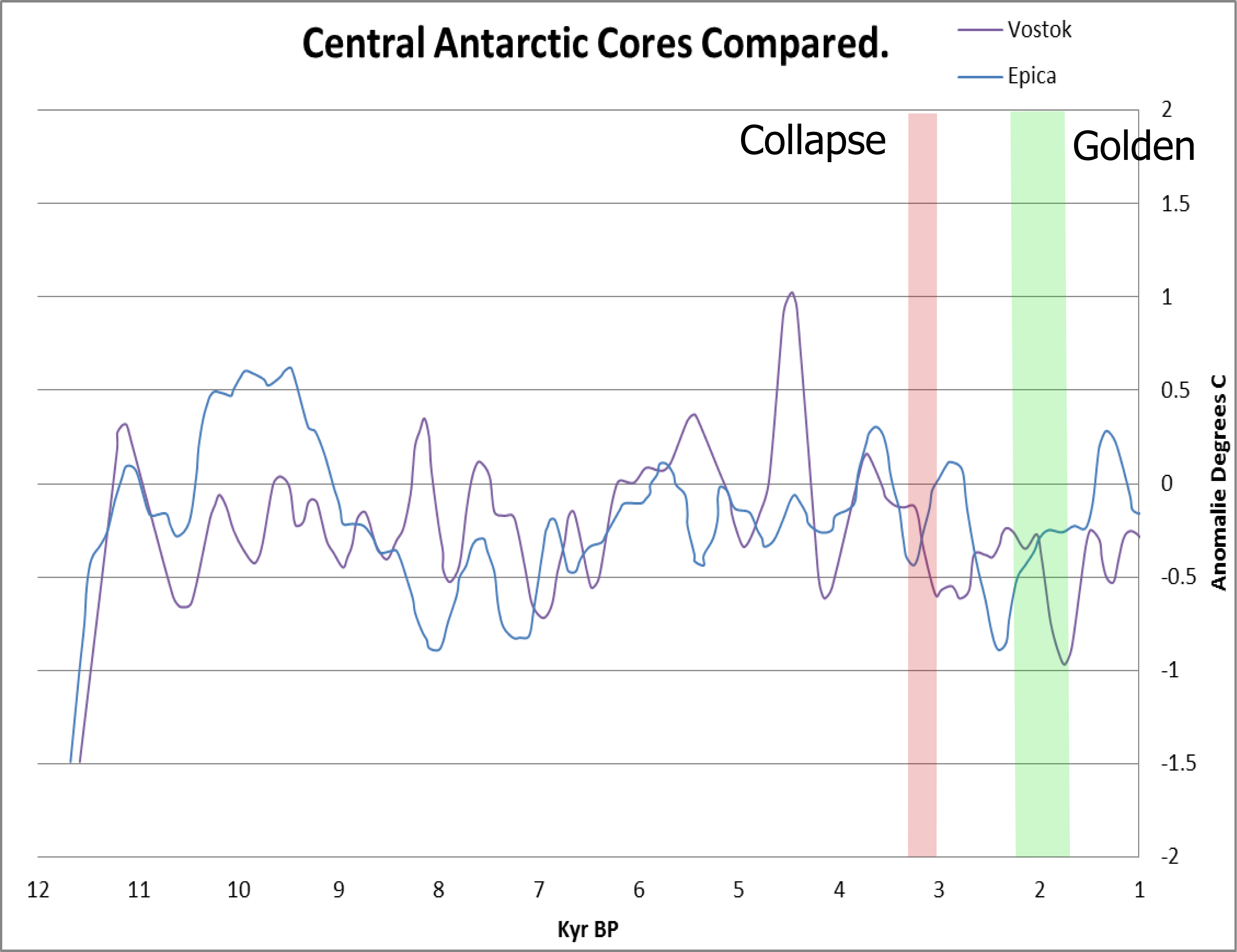
There is little reason to expect Eurasian subtropical civilizations to be affected by Antarctica, but this is included to show that the EPICA Dome C core about 500 km less central in Antarctica did not show the 4.5 kya spike.

Three Spikes Annotated

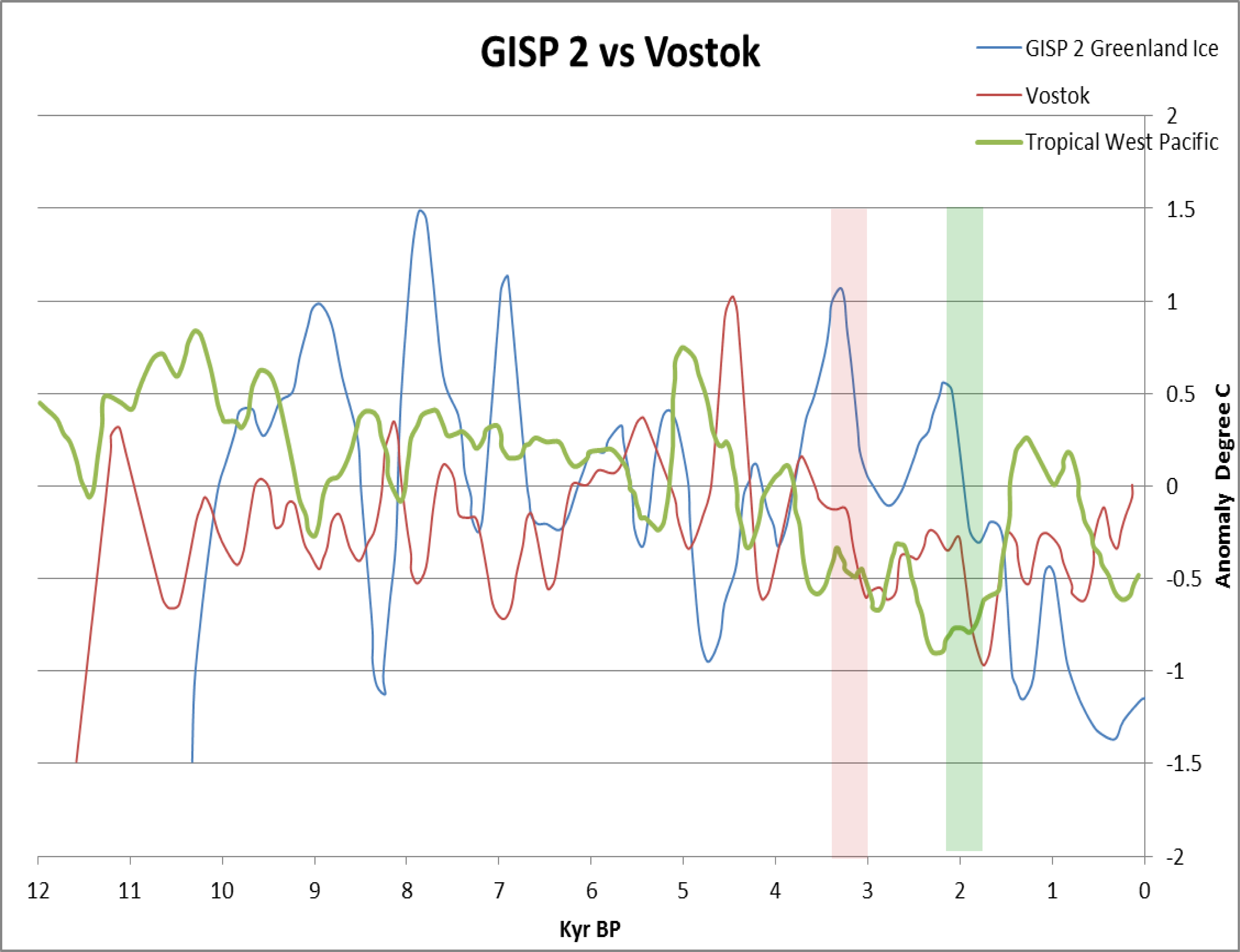
This graphic shows the three spikes, the first is in the western tropical Pacific about 5000 years ago, the second is in Vostok 4500 years ago, and the third is the Minoan. I remain convinced that all these proxies are good representations of regional differences. It is quite likely that regional spikes occasionally telegraph through time and space. While there are several impressive Greenland spikes, the 5 kya Pacific spike and the 4.5 kya Vostok spike are definitely out of character. It may be that we need to understand signals moving as waves through the geosphere before we can truly put history on ice.

Posted in Climate, Climate and Civilization, Climate Change, Geography, History | Tagged | Leave a comment

Hydrocarbon Combustion Water Vapor and it’s Greenhouse Effect on Surface Thermometers

untitled

Nobody ever thinks about this, but when you drive your car down the street, when David Crosby drives his Tesla into a pedestrian, when solar cells wrought with energy from fossil fuels produce energy for the grid; twice as many molecules of di Hydrogen oxide (water) as Carbon dioxide result from the combustion that produced the energy.

Everyone says, ” So what, it’s just water”. True enough, we drink the stuff, or die, but nevertheless water is the kahuna of Greenhouse gasses on this planet, even by the befuddled standards of the evangelists who would relegate it to “feedback only” status. Carbon dioxide amounts to less than 10% of the greenhouse gasses.

Everyone is SO confused lately why surface thermometers in boxes at airports and cities have been reading so much hotter that the satellite observations of the lower atmosphere.

rome_italy_airport_weather_station_large2

Really? Honestly, Carbon dioxide does contribute in some trivial way, but the airport/urban temperature record is so ridiculously biased by the LOCAL contributions of both gasses, it should be no marvel to even evangelists that the surface temperature reads hot.

Your basic 747 uses about a fifty gallon drum per minute during liftoff. Let’s just say 25 gallons of aviation kerosene greenhouse gasses plus direct enthalpy contributed to the immediate vicinity of the weather station PER PLANE…

Posted in Climate | Leave a comment

Truckin’

IMG_0227My son, having graduated from UCLA in Math/Econ and worked for a year at a bank, took a notion to try his hand at long haul trucking. We parents were not particularly thrilled with this move, but having personally abandoned my family’s long academic tradition in favor of a career in construction, there was little I could say.

He was a very good trucker, I’m proud to say, and won awards and bonuses for safety and fuel economy, acquiring the handle Taydawg the hippy trucker. You see, the trucker mentality is git on down the road as fast as you don’t get caught, and they don’t take kindly to being slowed down by someone driving safely and saving fuel.

I wanted to experience this bit of Americana and as his trucking career was winding down I had the good fortune to share a good portion of his last run.

Trucking is basically our system for resolving the problem of stuff in the wrong place. Possibly analogous to the body’s lymphatic system, it is often unsavory. Our first stop was industrial East Oakland, basically in the center of the Maize. We swapped our 54′ trailer for a 48 footer preloaded with near the legal weight limit of crushed aluminum recycled door and window frames.

east Oakland

This was it. Around the corner a parade of pickup trucks similar to the one shown stretched around three sides of the block bringing a seemingly endless supply of urban ore.

Yet it was in the wrong place. According to the laws of supply and demand this particular 38 tons of condensed fenestration needed to be in Spokane. Oh well, it was our fate, and we hooked it up, took it to the scales where we drove back and forth to be sure no individual axle was overloaded, tarped it, and headed out.

It was 1:30PM, just in time to surf the afternoon traffic swell out of the bay area. Not that we were hanging ten. Urban trucking is an exercise in caution and anticipating the clueless potential road kill to whom 38 tons of supply and demand are merely annoyance.

While our trip began in the industrial underbelly, most of my stint was as close to a stage coach run as modern trucking gets.

Yet there is this downbeat of industry with every pickup and drop-off point. We get to Kaiser Aluminum in Spokane and it is totally mill town, lunch box, dumbass corporate, “Your appointment isn’t until noon” mentality. The Silicon Valley ethic really is an important lesson for the world. Suck it up, figure it out, work late, work harder, make it happen. Sadly missing in Spokane.

IMG_0175

A vignette of our smooshed fenestration as we languished half a day at Kaiser Spokane contemplating their forklift friendly Aluminum “”ingots”.

They almost wasted our entire day, but thanks to a hardworking driver manager in Tulsa we were able to get a new load at 5:30 PM Tulsa time. It was 2×4 lumber in Troy , Montana, a few hours away, to be hauled to Eau Claire, Wisconsin. Some quick Google vectoring revealed that the best route was across U.S. 2, the most northerly highway through Montana and North Dakota and down through Minneapolis which would be my best flight home.

This would be my last load, and it was only 29 tons, even after a last minute addition. We “camped” in their driveway after arriving in the dark. It was 18 degrees when we arose at first light and pretty understandable why our appointment was at 9:00. Pretty chilly for milling outside. The place was a mess with maybe three acres of mill ends and bark they may have found some insufficient market for in the form of mulch, which they were actively shredding and bagging.

IMG_0179

In a sense the antithesis of Kaiser, they were frank, allowing that they had not yet finished the addition to the order, and helpful in every way they could be. Small town, local, family owned. I walked to town for hot coffee passing the good ladies of Troy hiking society, and found the good ol’ boys shootin’ it over substantial breakfasts at the local eatery.

IMG_0184

IMG_0188

Jeffersonian America.

Our route took us through Glacier National Park.

IMG_0197

IMG_0212

Then across the plains to Williston, North Dakota. If Detroit is the modern ghost town, Williston is the modern boomtown. Lots of Carbon coming out of the ground, lots of trucks hauling it.

IMG_0250

Williston truck stop sunrise.

IMG_0251

Plenty of grimy work to be had supplying the demand. And here we were, carrying lumber from Montana to Wisconsin. The demand is increasing. Thanks to my friend Patty, the maps below show the differences in the most common occupation in each state.

1978

1978

2014

2014

Taylor actually carried an awkward load of Golden Arches, but we have not become a nation of hamburger flippers. We have become a nation of truck drivers. Like ants, carrying far more than their weight, the drivers scurry our stuff from where it is to where we want it.

Most of us have no idea that just outside our cities hundreds of trucks circle the wagons on acres of tarmac every night. They sleep in bunks in the cabs, automatic motors cycling on and off all night. They drop their loads in the morning and try to get loaded and out before the traffic and find refuge in another truck stop the next night.

The road goes on forever.


Posted in Anthropology, Geography | Tagged | Leave a comment

Oil and the Devil


The concept of the devil in the Judeo-Christian/Muslim tradition seems to have its roots in an older Persian and possibly Indo-European notion of opposing forces of good and evil. The Christian conception developed into the elaborate scheme described by  Dante which was integrated into Ptolemaic geoocentrism and the music of the spheres.

upper-hell

In Dante’s elegant construction the earth’s core and the devil’s lair was actually frozen but the higher levels are unbearably hot. In the music of the spheres impressive postulations of epicycles were required to reconcile the observed motions of the planets with the preconception.

Music of Spheres

It is easy  to imagine how humans would be extremely impressed with volcanoes, earthquakes, tsunamis, hot springs., and crude oil exuding from the earth. All of this fit very nicely with notions of Hell and the devil. Even during the scientific revolution the likes of Isaac Newton believed in Mephistopheles as a universal force of evil who launched legions of devils to carry witches to evil convocations in the woods.

natural-oil-seep_4_700x700

Oil is naturally repugnant to humans. We did not invent it. A million tones of it a year oozes naturally in seeps like the above. Photo credit groundtruthtekking.org.

We still think of evil empires and evil forces, slavery, genocide, even alienation if human rights as a global plasma of evil in essentially the original Persian or Indo-European sense. With allegations that human combustion is endangering the planet, oil has easily been tarred as a force of evil, perhaps an excretion of the devil.

With our conceptions framed in this polarized way, between forces of good and evil, it is very difficult to reach a nuanced understanding of reality. We have made great progress unwinding misconceptions about the earth’s place in the solar system, but we hang desperately to the notion that we are still somehow special.

We look deep into the earth now using waves generated by earthquakes.

picture21

We approximately find Dante’s rings but we find no “Unbaptized and Virtuous Pagans” down there. The oil we vilify very likely is produced by deep bacteria eating mineral methane gas. We must learn that we are simply insignificant and that forces of good and evil are entirely our own constructions.


Posted in Anthropology, Climate, Geology, History, Religion | Tagged | Leave a comment

California Drought Update February 2015

It seems from the great wailing and moaning that we have arrived at a new definition of drought. The new definition is whatever is inconvenient for 30 million people regardless how much rain falls.

I am a big fan of the San Francisco dataset because it is the oldest. In the graphic below the five lowest rainfall years are in thin lines and the last four below average years are heavy lines.

SF Rainfall Feb 2015

The 2013(-14) rainfall season is the twelfth driest in the SF data. The current 2014 season is looking average so far.

Welcome to California!

Posted in California Drought, Climate, San Francisco Rainfall | Tagged | Leave a comment

The New Ptolemy

The evolution of consciousness since the Enlightenment can be thought of as the progressive, and unwelcome realization of human insignificance. We inhabit this rock, spinning in infinity*, the center of nothing, outweighed in biomass by ants. God still loves us, right?

Or not…did we piss them off?

Sacrifice a goat. Sacrifice the SUV’s, whatever. Repent, ye sinners!

Where is your pride? We have enormous powers! We can change the planet’s climate with our fire. We are the Anthropocene! We can wipe species off the map with our axes. Just not the ants…

*Credit Paul Simon

Posted in Anthropocene, Anthropology, Climate Change, History, Metaphor | Leave a comment

Further GRBaV Observations

A number of things we have noticed about red blotch did not really fit into the themes of prior posts but we feel bear mention.

The first, along the lines of Dr. Golino’s finding of a similar virus in a leaf from Sonoma County in 1940 is something we bumped into on the UC Master Gardener website.

Roger's Red

“Roger’s Red” apparently is a prized “cultivar” for horticulturalists. Photo credit houzz.com. A google search will show that this vinifera/californica hybrid first found by Roger Raiche along Palmer Creek Road west of Healdsburg in 1983 has been propagated far and wide as an ornamental.

We sent an email suggesting this be tested for GRBaV to Master Gardeners and were assured the suggestion has been sent to Rhonda Smith.

The second is just an observation we make no attempt to interpret of unusual cane reddening and subsequent abnormal growth in a miniscule subset of symptomatic vines. We have not found it  in any asymptomatic vines, and it seems randomly distributed.

IMG_0742 We first noticed it before overall leaf drop in some symptomatic vines vines that prematurely lost their basal leaves. Early basal leaf drop corresponds with the first year of symptom development to our eyes. In contrast, we find reduced abscission in fully developed gross symptomatic vines similar to that from girdling by breakage or the beetle.

IMG_0012

This photo does not show it very well but in December we found unusual growth from these reddened canes. We could go around the vineyard to a half dozen places where red leaves were still hanging on and find growth like this from reddened canes.

The last is a quick comment on the red blotch state of affairs. Dr. Daane has been unable to get leaf hoppers to transmit blotch even at feeding levels barely sub lethal to the plants even though the virus can be assayed in their guts. The vector  remains at large. In Sonoma county researchers have had difficulty finding GRBaV negative control vines for comparison studies. Most assays performed so far have been to verify symptoms. The cost to systematically assay a vineyard remains staggering. We really have no idea the extent of this disease except as it is revealed through symptoms.

Posted in GRBaV, Red Blotch Disease, Wine | Tagged , , | Leave a comment

Say Watt? Or Why I Just Love Math

Mathematics is one of the many human languages. It is written in very impressive hieroglyphics that can include multitudes of “terms”, many of which are given Greek letters. This language has been very much in fashion since the Enlightenment and in the popular imagination anything written it has an automatic aura of truth.

To decipher this language it is necessary to define the “terms”. Recently I had a go with watts.

A watt is defined as one joule per second. Very nice. We know what “1” is and our clocks tell us what a second is, but what is a joule?

A joule is the energy required to move one kilogram one meter using one newton of force.

Um, if the newton is doing the work, why do we need the joule? A supervisor, perhaps.

Will we ever know what a watt is? They just keep adding new terms.

Ok, a newton is the energy to move one kilogram one meter at the RATE of one meter per second squared.

Hooboy, we ALREADY moved that kilo a meter back when it was a joule. The crowbar we used was a newton. Now they say our crowbar was just the energy to produce a certain (and seemingly arbitrary) rate of movement across a meter. Is a definition circular if the energy to move a kilo a meter is defined by the energy to move a (presumably different) kilo a meter in the square root of a second? Why are we squaring the seconds, anyway?

We delved into this squared thing a while back. Sir Isaac just loved squares and his finding that gravity diminished (crudely) with the square if distance may be the hazy rationale for our definition of a newton. Yet our watt, if we can remember back that far, is already a rate. We are defining a rate with a rate.

So here is our evolved hieroglyphic for a watt:

1w=(1k/m/s2 moving 1k a distance of 1m)/s

w=((k/m/s2)km)/s or some such.

At least it is a precise definition, but somehow I still don’t feel I really know what a watt is, and if that is the precise definition, why didn’t they just say so to begin with?

Posted in Anthropology | Tagged | Leave a comment

GRBaV, Heredity or Environment?

The burning question in the vineyard business these days is whether or not to rip out and replant Red Blotch infected vines. On the one hand, the first variant of the disease has spread at an average of maybe 4% per year at the UCD Oakville station. This might be a rate of spread that is manageable now that we are dialed into the symptoms.

On the other hand, a second variant of the disease has seemingly invaded the Oakville station from a different direction and general symptoms have spread to very nearly 100% of vineyards in Napa, Sonoma, and Mendocino counties within the last few years.

The best estimates of the latency period between infection and symptoms is 1-2 years. The average rate of vineyard replanting in Napa and Sonoma is on the order of 5%. In the seven years since GRBaV was first noticed, we might expect that 35% of the vineyards have been replanted.

All of these vineyards could potentially have been replanted infected. An equal number of additional vineyards infected by transmission from neighboring vineyards at the internal vineyard rate might bring the expected total to an aggregate 70% of vineyards possibly infected by planting and transmission since 2008. Yet if we accept the two year latency, no vines planted or vector infected this last year should be symptomatic yet. This would reduce the expected aggregate infection since 2008 to 60%.

Turning this analysis on it’s head, to reach the 100% infection of vineyards observed, it would be necessary to postulate that for four years prior to 2008 beginning in 2004 the same rates of infected planting and transmission to an aggregate infection of 40% of vineyards by 2008 went unnoticed.

Maybe.

Oakville station is a very small sample size and it is possible that internal rate of spread there is not representative. Yet this low rate is roughly consistent with the rate observed in a completely isolated vineyard an order of magnitude larger.

An alternate possibility is that the virus spreads more efficiently between vineyards than within. This possibility could explain edge/road effects. The vector would prefer the dust and turbulence of frequently travelled roads to the intermittent passage of machinery and workers within the rows. Then again, it could prefer ambient vegetation to vines and be a reluctant invader.

The edge/road effect is pretty ironclad, but what does it really mean?

IMG_0667

If it means that a vector is established in ambient vegetation or an adjacent vineyard or block and efficiently colonizes the edge of a new vineyard or another block, why would it spread less efficiently within the new vineyard or block? The Napa valley is essentially grape monoculture, one giant vineyard. The areas of ambient vegetation are limited to the perimeter of the valley, a few creeks and volcanic knobs, and landscaping.  If this is what is meant by edge we should see a pattern of infection emanating from theses areas. This is not what we see. We see a pattern of infection along roads throughout the monoculture.

The very existence of this road pattern within individual vineyards and within the monoculture as a whole suggests that there is more going on than a monotonic internal rate of spread.

The following is the pattern of grossly infected vines in autumn 2014 in an isolated vineyard. An isolated vineyard can be thought of as a microcosm for Napa or Sonoma valley monoculture.

2014 Blotch


The red vines are defined as grossly symptomatic with more than 50% red canopy. The blue vines are missing in action and undoubtedly victims of trunk diseases and landslides. There are a few yellow vines shown that are really red but convey misinformation because they were transplanted or budded over.

There are three rootstocks. The light grey is 44-53, the darker grey is 99R, and the black is 1103P. A quick take is that the 44-53 is wildly symptomatic. I have written this but I hereby repent. A more careful analysis reveals that the combination of 44-53 rootstock and the CS337 clone best explains the disparity in distribution.

The vineyard provides a way to separate the variables. Most of the 44-53 rootstock was  grafted with CS337, but not all.

By Rootstock

When the data is sorted by rootstock it becomes clear that when the 44-53 is paired with CS 4 there is a drastically reduced rate of gross symptoms.

By Clone

When the data is sorted by clone it is apparent that it is not just the clone either because when the 337 clone is paired with 1103P rootstock the gross symptom rate also drops off dramatically. The 44-53 and 337 seems an unhappy pairing.

Heredity plays a role.

Environment seemingly as well.

4453 337

The image above is cropped to highlight the extent of the 44-53/337 in the vineyard. There are two areas divided by a heavily forested area and a 300′ ravine. To our eyes they are different animals. In the tradition of phylogenetics and population biology we conclude that the upper area with 34% average gross symptoms is the original source of infection. This area also shows far less edge concentration. In contrast, the lower area shows striking edge concentration.

14 15 16

The image above is of the upper portion in 2009, the image below of the lower portion swung around to a similar view attitude on the same date.

Blk 12

While the reservoir side clearly shows red leaf symptoms in October 2009, the other side does not. It should be noted that the 28 qPCR assays we have  done so far of symptomatic vines have all been positive for GRBaV and RSPaV but negative for all other viruses tested. We also performed two phytoplasma assays which were negative.

We know so little about this virus that is premature to jump to grand conclusions, but our evidence suggests that the virus spread from the reservoir side to the other side of the ravine along the roads. The notion of road dispersal is further reinforced by observations of roadside infection of wild grapes and even cultivated grapes overhanging St Helena/Spring Mountain Road.

While this road effect is by no means certain, the possibility that it is real is a very important factor in any decision to replant a vineyard. If the new vineyard cannot be protected from reinfection, the effort is pointless.

As much as we would love to believe that the distribution of GRBaV follows from grafted heredity, our information suggests that the environment is a very important factor as well.


Posted in Biology, GRBaV, Red Blotch Disease, Wine | Tagged | Leave a comment

The State of the Onion

Let’s say the way this planet works is an onion. There are many layers and they interact in ways far more complex than onion rings. Yet we have to start somewhere, and peeling back the layers of this onion can at least help us grasp the huge holes in our understanding.

Let’s start around the middle of the onion at the surface of the earth. A very significant transition takes place here between land and water on one side and air on the other. The water is confounding because it fills in low areas we might be inclined to call land if there were no water there. These low areas get quite deep and are so extensive that 70% of the planet is covered by ocean.

The ocean and the atmosphere have mirror image onion layers beginning with a mixed layer and progressing to stratified layers.

Atnosphere and Ocean

The lower image above is the ocean and the upper the atmosphere.

The Aristotelian elements, air and water have different properties, but at the interface and extending up ten kilometers in the atmosphere and down somewhat less than a kilometer down in the ocean are turbulent mixed layers. These mixed layers both transition, up and down respectively, to stratified layers that make our onion proud. The atmosphere has more layers and is more complex because gravity assures that cold materials go nowhere but down and warm materials go nowhere but up. The ocean below the “clines” is simple and incredibly stable because there is nowhere for it to go. It is constrained at the bottom by another Aristotelian element, earth.

There are generally two sorts of earth, continents and ocean basins.

fig5crosssection

This graphic by NASA shows the general layers of oceanic crust.

nw0105-nnc

This graphic (credit unavailable) is a good general representation of the onion rings of sediments overlying the different sorts of igneous rocks (ocean and continental and their relative densities) and the mantle layer below. The oceanic crust is to the right and continental crust to the left.

Since we are downward bound from the middle of the onion, lets head for the center of the earth.

 picture21

This graphic (credit Geopangea Research Group) is a good representation of the earth’s internal onion rings. Each layer is known from a change in velocity of seismic waves from earthquakes.

Problems with our understanding of the onion begin at the core. It has long been posited that convection within the outer core creates the earth’s magnetic field. A nice, easy answer, but it happens that Iron melts above its magnetic Curie point. Above the Curie point a material loses its magnetic properties.

Let’s just say we have no idea how the earth’s magnetic field is generated.

The seismic waves from earthquakes show us amazing things. Above the core/mantle boundary there are two very interesting extrusions.


Doughboys

To me they are doughboys. Credit Ritsema. One can think of them as Atlas holding up the earth. The important thing is they flatten out at the 660 km discontinuity like thunderheads hitting the stratosphere.

We have long been told that mantle convection causes the continents to move.

Dashed Conceptions

Childish conceptions like this. Credit unavailable.

The very same seismic waves that illuminate the doughboys show us this simply isn’t true.

Ritsema

The mantle is substantially stratified. Nothing anywhere near mid-ocean convection driving ocean floor spreading is in evidence.

Kustowski et al 2008

These sections from Kutowski et al (2008) show that the ocean ridge system is in fact a shallow feature. It is readily apparent down to 100km but vanishes as a linear feature before the 660 discontinuity and is unrecognizable in the Perovskite at 1000 km in the lower mantle. At the core/mantle boundary at 2800 km all that remains is the doughboys.

If the doughboys are feeding the ridge system at all they are doing it through tiny venturi in the Perovskite and then spreading out as massive sills. Other offset venturi through the intervening layers and the Mohorovicic (MOHO) discontinuity would then need to feed the sinuous dead end rivers of the ocean ridge system.

Doesn’t really work for me but  the raw edge of human understanding does not bear waxing pedantic. Another very serious problem is that the MOHO just below the crust marks the beginning of a low velocity ductile zone generally referred to as the “asthenosphere”. It is on this layer that crustal “plates” are supposed to be moving. Trouble is, seismic waves appear to show that continents have roots far deeper than this.

ngeo1982-f2

Credit NatureGeo. Continents appear to have roots that extend to 400 km near the base of the Olivine layer and the ductile material that allows their movement may be more a result of local pressure from movement forces than from a continuous ductile layer.

Let’s just say we have no idea why the continents are moving.

We are working our way backwards from the core of the onion and listing the problems with our understanding. We have reached the surface where we live and where we started. Take a deep breath of the atmosphere.

The atmospheric mixed layer, called the troposphere, is thought to have varied in average temperature within a range of six degrees for all of geological time. We happen to live in one of half a dozen glacial periods known in geological time so it is comparatively chilly out. Furthermore, the last three glacial periods including our own have been characterized by oscillations between glacial and interglacial episodes. We live towards the end of an interglacial.

We have no idea what causes glacial/interglacial fibrillations nor what causes the macro scale glacial periods to come along every few hundred million years.

Iceindex

This is what the descent into our current ice age, the Pleistocene, looked like.

Let’s just say we have no idea why the mixed layers of the lower atmosphere and ocean warm and cool.

The next layer of the atmosphere is the stratosphere. It’s a long way back to the first graphic so it is reiterated here.

1000px-Comparison_US_standard_atmosphere_1962_svg

Temperature declines steadily through the mixed layer or troposphere for a bit over 10 km and suddenly flatlines up to about 20 km  where it starts warming again and this warming accelerates through the ozone layer in the mid stratosphere. The warming continues well above the ozone to the top of the stratosphere at about 50 km where cooling resumes throughout the mesosphere to about 80 km where it flatlines and then warms in the thermosphere.

One weird onion. Strange how the speed of sound follows temperature rather than density. We ain’t done yet. There is at least another 100 km “sphere of influence” above the thermosphere.

2004-van-allen-belts

This is a NASA image of the Van Allen ring currents, more a donut than onion rings.

mbs1

In this graphic from the Chinese Academy of Sciences we reach the outer skin of our onion. Beyond the onion we get into the rest of the universe, 95% of which seems comprised of dark energy and dark matter of which we have no understanding.

So what is the state of the onion? It is just a silly metaphor to attempt to reduce head spinning complexity to something we can get our heads around, yet even at this dumbed down level our understanding utterly fails.

1. We have no idea how or even if the planet’s core produces the earth’s magnetic field evident in the “bow shock”, the flakey outer skin of our onion above. We further have no idea why it periodically and erratically switches polarity.

2. We have no idea what is causing the crust to move.

3. We have no idea what is causing changes in oceanic and atmospheric temperature nor why these changes seem limited to a range of 6 degrees  over geological time.

Generally, we are missing a lot of energy, both inside the onion and out.

Posted in Climate, Geology, LLSVP's are Doughboys, Magnetic Reversals, Moho, Oceanography, Seismic Tomography | Tagged | Leave a comment